Published with Blogger-droid v1.6.8
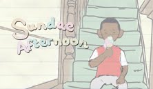
This is an online journal of the progress and pitfalls of my latest film, "Sundae Afternoon".
Monday 4 July 2011
The end
So, after ten solid weeks of hard graft the 'Transcriptions' project is over. It's been an important and pivotal journey for my development as an animator, and will take this opportunity to thank all my classmates for helping me to have this collective experience. While I'm at it, I'll shout out to my mentor, Wes. He gave me sound advice and made sure I knew how to plan the project out. For those interested, 'Sundae Afternoon' should be playing at Graphic Bar (Golden Square, London), along with the other graduate films from LAS18. There will also be a private screening at the National Gallery in September, so watch this space. The majority of my posts will now be from my main blog page, so stay tuned for details, work and hopefully a design revamp.
Thursday 2 June 2011
Final countdown
I'll be presumtipous, and say that by the time you read this I'll have less than 10 days worth of studio time left to complete my film. Next Hype!
Here's is where I'm at, so to speak:
This is almost the rough cut version that I'll be sending off to my composer tomorrow (or sooner, depending on how fast I can re-shoot/tweak)
What are your favourite scenes? Is is poignant? Amusing? or just looks fun to see fully animated. Please let me know, as feedback has helped this film progress and come a long way, as you can see if you go back down through my uploads.
Here's is where I'm at, so to speak:
Week 27_Transcriptions Rough Cut_Second Draft from Karl Lawson on Vimeo.
This is almost the rough cut version that I'll be sending off to my composer tomorrow (or sooner, depending on how fast I can re-shoot/tweak)
What are your favourite scenes? Is is poignant? Amusing? or just looks fun to see fully animated. Please let me know, as feedback has helped this film progress and come a long way, as you can see if you go back down through my uploads.
A brief aside...
Oi, reprobates. Watch this, yeah. Safe.
What I mean to say is, this is a graduation film from UCA called 'Cracked', directed by Jamie Kendall, and soundtrack by Daniel Cross. Nice premise and worth a watch.
What I mean to say is, this is a graduation film from UCA called 'Cracked', directed by Jamie Kendall, and soundtrack by Daniel Cross. Nice premise and worth a watch.
Monday 16 May 2011
SLooooooooooooooooooooooooooooow Down
Quite worried that the pace of the film is still too fast. What do you think. Feedback much appreciated as I need this (near) perfect by Friday morning!
Test Run from Karl Lawson on Vimeo.
Thursday 12 May 2011
The hills are alive, with the sound of music
Today we got to meet the students from the RCM who will be potentially composing pieces for our films. Have to say that they were a really talented bunch. Did spend some of the presentation time with Han discussing who's music suited each animator, with the class agreeing unanimously with subtle nods that one of them is perfect for Emma.
At the moment I'm working towards the rough-cut deadline of next Friday at 10am. Fiddling about with some shots and angles. Main concern is that the timing will still be too fast and now the RCM are involved there's a pressure not to let them down by screwing around with your timing, so has to be airtight!
Wish me luck.
Monday 9 May 2011
Problem!
Something that's just been going through my mind is that several people watching the film end up feeling quite sorry for the boy. People are reading into the story that the dad is neglecting the child rather than the dad being tired having just got in from work (or something to that effect). Are there any shortcuts to establish a relationship that makes the dad look more caring and overworked than lazy? Also, are there more ways of making this kid less likeable without changing his physique (so, no suggestions for make him fatter)
Ideally, not looking for a major overhaul but will take all opinions into consideration.
Solutions/Comments below,
Thanks.
Ideally, not looking for a major overhaul but will take all opinions into consideration.
Solutions/Comments below,
Thanks.
Thursday 5 May 2011
Changing Rooms
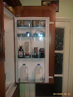
I decided that in order to keep my set constant and to get a homely feel, I needed to both research living spaces, and create my own in its entirety, rather than shots here and there. However, given the lack of time at my disposal this had to be quite a quick process, so no time for Maya modelling. I decided to start with the fridge, as it's one of my favourite shots from the animatic, but I soon realised that I don't know what a fridge door looks like, as I'm usually just grabbing isolated items. I had a look on a few images from websites but decided first hand experience would be best, so I looked at both the fridge in Back Hill and at home, and did a quick sketch or two. Hopefully this comes across in the animation.


What I did next was take photographs of similar locations in my own house that appear in my film, so the staircase, the living room and the hallway. I tried to get a focus on the smaller items that make a place feel more homely, e.g. embarrassing photographs from one's childhood, pot pourri and staircase spindles.
 Ikea's Finest
I after taking these images I went about drawing each wall of the set from the opposite side of the room, until I had all four sides of the lounge. I instantly saw flaws in the positioning of certain items from both the perspective of the film, and common sense. I then annotated on the scans of the images.
Here are my initial sticking points:
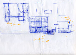
This is the wall you will see in the film, and probably the one shown most throughout. Naturally, I had a strong idea of the main positions here. The window had to be far enough from the dad's chair to mean the boy has less chance of waking up his dad. What I've noticed is that it may need to be bigger as it is the main window in the living room so I may have to adjust the height as the width needs to be somewhat narrow. The little table is just to rest things on so you get an idea that it is part of the dad. Resting say, a mug, or a newspaper on there as part of a routine. I may remove the wall hangings as it could look a bit cluttered.

This is the wall that leads to the kitchen. I liked the idea of an open archway leading into the kitchen. I think this makes the idea of the sound travelling from the window to the kitchen and the boy hearing it a bit more believable. Due to later realisation, which I will get on to, I would probably have to move the sofa closer to the CD rack, and even move the arch a bit more to the left as well. I like the how the wall doesn't seem very busy but it doesn't look bare.

This the wall that I'd given the least thought to prior to drawing it, but most of the action happens over here. The table is where the dad first walks to, off-screen. He will put down his keys and wallet then amble to his armchair. I'm not sure of the design of the table yet but I'm reasonable happy with how this one looks.

Here is the main issue for me. There needs to be a door where the lamp is to lead to the hallway/staircase so that the kid has two exit points in the room. The walls look ridiculously empty. I don't want there to be a massive HD television on the wall, primarily because I originally wanted this set in the late nineties. I guess I'll need to canvas some more opinion and research to fix it but it seems to be the odd one out in terms of final positioning.

More stuff soon.
Later.
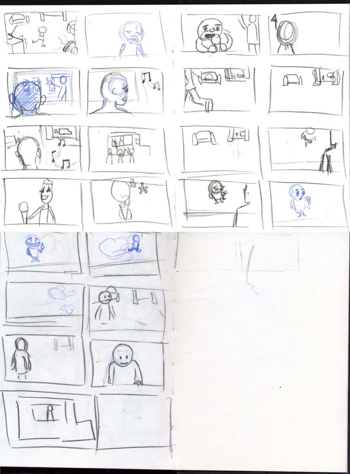
Tuesday 3 May 2011
Shimmy Shimmy Quarter Turn
Here are the aforementioned model sheet drawings. I figured the best way to show these was both in picture form, but couldn't find a way to keep the grids and guides to stay on a n exported image, so I've exported this to a .mov file and here are the results. I did do a bit of research on this for proportionality, and according to my research a 10 year old is roughly ¾ adult height, hence why the grids would have been nice to have.
What do people think about the colours, particularly with the father's attire. I'm slightly concerned about over-saturation. (Comment and let me know!)
My next post should be the layout stuff, so stay tuned.
What do people think about the colours, particularly with the father's attire. I'm slightly concerned about over-saturation. (Comment and let me know!)
My next post should be the layout stuff, so stay tuned.
Model Sheets from Karl Lawson on Vimeo.
Tuesday 26 April 2011
Model Sheets
The time that the crazy level kicks up a notch... I've found myself having an internal discourse about the merits of my character having a curved hairline instead of a straight one. This will be a long afternoon. I plan to upload the model sheets of both characters and any left over designs by the end of the day so stay tuned.
Thursday 21 April 2011
The Boy with a Million Faces... (but no name)


Basically what I'm doing today is working with shapes. At first I decided which shapes I like for the character, though I did have some preconceived notions of how I wanted him to look, such as not having a nose, simplistic eyes, being quite wide mouthed and toothy.
As I started messing about with the shapes I began settling on some constants, the large circular head, a pointy jaw, and sticky-out ears. Still working on the hair and the subtleties of the facial design, for example on the last drawing in this post, I noticed that moving the eyes and mouth closer together made for a younger looking character, and while the nose looker good on some characters it made the boy a bit more cute and likeable, so that's a no-go.
Another post to follow shortly, after pilates me thinks, so watch this space.
Wednesday 20 April 2011
Second Draft
Transcriptions Animatic - First Draft from Karl Lawson on Vimeo.
Transcriptions Animatic - Second Draft from Karl Lawson on Vimeo.
I'm just going to run through the main changes I made to the film, and explain why I thought they were necessary. Please feel free to comment if you agree with them or if you think they don't work as well.
Opening Scene:

The opening shot is a close-up pan across the floor towards where the boy is. Firstly, I added this to act as an establishing shot. My second reason for it is to set up later story. I want to give the impression that the boy has smashed up his piggy bank and bought crisps, sweets, fizzy drinks etc. with his allowance, and now there's nothing left (except his pile of mess) I wanted this to also show the character's greed in terms of the amount of food he is snacking on.
Fridge Scene:

From an aesthetic perspective, I like this shot as it is quite common practice in film and television. The majority of the shot stays the same, but he now hears the ice cream van from the kitchen rather than sulking back in the living room. This is a time saving device but I think it's also valid in the sense that you get the faster change of reaction. I think that ties in again with his impulsive character traits.
Window Scene:
Initially the boy runs up to the window, excitedly and checks his pockets for money. Then having realised the has already spent it, he walks away forlorn. When I showed this at the National Gallery, they said that him being broke didn't come across clearly enough. It was suggested that I use the classic cartoon cliche of him emptying his pockets. I felt that it would read better, but personally I dislike it.

Instead, I had the character remember in his own mind that he spent all his money, and aim to show this through his facial expression. I also added the shot of the broken piggy bank again to reinforce that to the audience. It is after this disappointment that the boy sees the wallet, and hopefully this makes him look more conniving that before, where he was trudging away from the window and then saw the wallet.


(Baldrick's Cunning Plan)
The End scene:

This is where the two animatics differ the most. I wanted the shots in the new animatic, of the boy gradually feeling ill to give a sense of foreboding. The idea that the dad offers him an ice cream as a treat, unwittingly this is a huge punishment, and the idea of it is what tips the boy over the edge (and leaves a mess on the carpet). I also believe that this way the focus is fully on the boy where as before the father was a bit more active, in getting up and finding his son in the bathroom. It just seemed a bit forced, and the audience didn't see the child gradually feeling worse either.
I'll probably update this again with more info, but I've got to get back to the designing. Ideally all sorted by the end of the day, after speaking to my mentor, Wesley Louis.
Thanks for reading, and leave comments below.

The opening shot is a close-up pan across the floor towards where the boy is. Firstly, I added this to act as an establishing shot. My second reason for it is to set up later story. I want to give the impression that the boy has smashed up his piggy bank and bought crisps, sweets, fizzy drinks etc. with his allowance, and now there's nothing left (except his pile of mess) I wanted this to also show the character's greed in terms of the amount of food he is snacking on.
Fridge Scene:

From an aesthetic perspective, I like this shot as it is quite common practice in film and television. The majority of the shot stays the same, but he now hears the ice cream van from the kitchen rather than sulking back in the living room. This is a time saving device but I think it's also valid in the sense that you get the faster change of reaction. I think that ties in again with his impulsive character traits.
Window Scene:
Initially the boy runs up to the window, excitedly and checks his pockets for money. Then having realised the has already spent it, he walks away forlorn. When I showed this at the National Gallery, they said that him being broke didn't come across clearly enough. It was suggested that I use the classic cartoon cliche of him emptying his pockets. I felt that it would read better, but personally I dislike it.
Instead, I had the character remember in his own mind that he spent all his money, and aim to show this through his facial expression. I also added the shot of the broken piggy bank again to reinforce that to the audience. It is after this disappointment that the boy sees the wallet, and hopefully this makes him look more conniving that before, where he was trudging away from the window and then saw the wallet.

(Baldrick's Cunning Plan)
The End scene:

This is where the two animatics differ the most. I wanted the shots in the new animatic, of the boy gradually feeling ill to give a sense of foreboding. The idea that the dad offers him an ice cream as a treat, unwittingly this is a huge punishment, and the idea of it is what tips the boy over the edge (and leaves a mess on the carpet). I also believe that this way the focus is fully on the boy where as before the father was a bit more active, in getting up and finding his son in the bathroom. It just seemed a bit forced, and the audience didn't see the child gradually feeling worse either.
I'll probably update this again with more info, but I've got to get back to the designing. Ideally all sorted by the end of the day, after speaking to my mentor, Wesley Louis.
Thanks for reading, and leave comments below.
Tuesday 19 April 2011
Character Design


I'm still having a bit of a mental struggle with this aspect. Firstly I enjoy the initial contrast in the animatic of the large father and the smaller son. The fact that he's a greedy git means that it might help the story to make him a bit fatter though.

(Chubby cheeks)
In terms of his character, I don't want any of you feeling too sorry for him. He's meant to represent one of those spoilt kids you see in the supermarket running rings around their parents making up noise. A bit of the annoying little brother about them too, a bit like Myles in Moesha.

Animatic
Bit of an absence due to illness but I'm about to upload my re-cut animatic. Hopefully, people will agree that it's an improvement on the original. The timing is slightly more worked out, and I'm looking to add a bit of sound to it (As we speak I'm creating a Premiere file to fiddle about with it).
Tuesday 5 April 2011
Open Plan
Just some sketches I did when thinking about the kind of space the characters will be moving about in.

This is just a rough one to do with directions the characters need to walk in and just a sense of what's around them.

This is a rough sketch (from memory) of my hallway at home

This is just a rough one to do with directions the characters need to walk in and just a sense of what's around them.

This is a rough sketch (from memory) of my hallway at home
Ideas

I'm just going to talk a bit about how I have developed my story so far.
After I chose the above painting to use as inspiration/reference, I tried to analyse it a bit. The story behind it is that the woman has traded in her virtue for wealth. I think that the painting has sexual connotations, as it seems quite moralistic and is to do with personification, also if you look closely there are two characters in the stone engraving, engaged in an amorous pose.
It's quite a small painting but if you look closely you see the woman crying. This is mimicked by the Cupid in the background. What I got from this is a story where the ends doesn't quite justify the means. This made me think of how naughty children behave, rather impulsively with little regard for consequence.
I wanted my character to initially be a portrayal of a child, who wasn't necessarily bad or good, but acted on what they wanted emotionally and thought of the repercussions at a later stage.
The basic story I came up with was a child who wanted an ice cream, but didn't have any money, so they had to steal some from their parent/sibling to buy it but then either they dropped it or ate it and felt ill.

I spoke with my tutor who suggested that the consumption of the food, then the outcome felt stronger than it just falling off the cone. Also, to decide how the audience should feel about the kid. I decided to make him less likeable than initially planned, and make him more greedy, so that his gluttony was his downfall.

I'm still a bit unsure on the ending where the boy gets his comeuppance. I have him getting ill but I'm not sure how far I should take it. On a personal level I hate the idea of vomit, and watched an Australian student film earlier this year about zits which made me feel physically ill, but Shelley Page told us to exaggerate a situation if something horrible is happening so it seems outlandish, and the feedback from the National Gallery sesh did ask for more vomit inducing food so I'll see where that goes.
Sunday 3 April 2011
Day of reckoning
On Friday April 1st, I had my animatic shown to my peers and tutors at the National Gallery. It was generally well understood, with some helpful hints and tips given. Please feel free to tell me what you understand, or don't understand and what you think is happening in the film, as I want it to be unserstandable for the viewer. Leave comments below or on the Vimeo link
I figure I'll let people watch first then post what my thoughts are and what I want people to get from it...
Enjoy
Transcriptions Animatic - First Draft from Karl Lawson on Vimeo.
I figure I'll let people watch first then post what my thoughts are and what I want people to get from it...
Enjoy
Wednesday 30 March 2011
Angles
Spent an afternoon trying to figure out which shot worked best for my character in the scene:
Contestant #1
Contestant #2
Contestant #3
Sort of settled on which one gets the idea across. Will update on Saturday with storyboard, notes, animatic and sketches.
Contestant #1
Contestant #2
Contestant #3
Sort of settled on which one gets the idea across. Will update on Saturday with storyboard, notes, animatic and sketches.
Thursday 24 March 2011
Decisions, decisions
Given the number of paintings in the gallery, choosing just one wasn't an easy task. I went off the the National Gallery and printed some tours. The idea of personification interested me as I thought that it would be fun to use the analogies and vary them to a character.
I narrowed down from 6 paintings, to 4, then to a final 2, in an ostentatious X-Factor style showdown. I finally decided to go with Godfried Schalcken's "Allegory of Virtue and Riches".
On a visual level, I chose this painting because I enjoyed the richness of the blue in the woman's dress. I also love the way the tears are painted. I don't know whether the copper it is painted on, or the actual size of the painting makes it difficult to see, but it's very subtle. The story behind the painting is also a major reason I chose it.
Trying to decide on stories at the moment so I should be posting again, before this time next week.
Brainstorming
This is a blog for my final film. The brief is titled, "Transcriptions" which is in association with the National Gallery. We have to choose a National Gallery owned painting from anywhere in the collection and use it as the inspiration for our final film.
Over the coming weeks I'll be updating this with ideas, scans, videos etc. To try and make sense of the whole thing.
Over the coming weeks I'll be updating this with ideas, scans, videos etc. To try and make sense of the whole thing.
Subscribe to:
Posts (Atom)